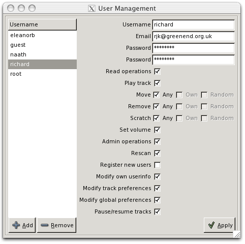
It'll look better if you arrange that the checkboxes' left edges line up (1) with each other and (2) with the left edges of the textboxes at top.
Might be a win to have a few more pixels between the text boxes and the permissions stuff, too, if having the window increase in size (or encroaching on the horizontal strip containing the "Apply" button) doesn't bother you.
I think I'd make the selection thing on the left say "User" rather than "Username".
Are the "Own" and "Random" options greyed out because they're subsumed by "Any"? If so, I wonder whether it would be clearer to have them checked as well as greyed.
Isn't there a purty anti-aliased tick you can use somewhere? The one you've got clashes a bit with the soft-edged plus and minus icons.
Hmm, yes. I'm not sure why GTK+ isn't getting the check buttons aligned properly automatically.
"User" and "username" are currently used interchangeably throughout user-facing material. I'll pick one...
Your guess about Own/Random is correct. I didn't want to have them forced to on if you hit All; if you turn All back off then you probably want to get the status quo ante.
I think "User" is the right thing when you're notionally picking a user (as e.g. for the box on the left) and "Username" is the right thing when you've got a user and are potentially editing their name (as e.g. for the box on the right). But "Username" is probably better (because it's more traditional and means less risk that someone will think they need to enter their email address or something) for login prompts :-).
You could have "Own" and "Random" *shown* as disabled-but-checked when "All" is checked, and then revert to enabled-and-whatever-state-they-had-before when "All" is unchecked, but maybe that would complicate the UI code more than you want :-).
If that tick is GTK+'s then whoever does their icons needs to be taken out and shot. It wants its proportions adjusting and it wants to be antialiased and it wants to look not-stupid when it's next to other GTK+ icons. Ah well, never mind; if it's what you've got then it's what you've got :-).
(no subject)
Date: 2008-04-20 07:50 am (UTC)(no subject)
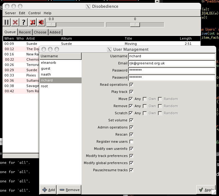
Date: 2008-04-20 08:14 am (UTC)Isn't that intrusive resize handle a total pain on OS X?
(no subject)
Date: 2008-04-20 08:42 am (UTC)(no subject)
Date: 2008-04-20 09:59 am (UTC)It'll look better if you arrange that the checkboxes' left edges line up (1) with each other and (2) with the left edges of the textboxes at top.
Might be a win to have a few more pixels between the text boxes and the permissions stuff, too, if having the window increase in size (or encroaching on the horizontal strip containing the "Apply" button) doesn't bother you.
I think I'd make the selection thing on the left say "User" rather than "Username".
Are the "Own" and "Random" options greyed out because they're subsumed by "Any"? If so, I wonder whether it would be clearer to have them checked as well as greyed.
Isn't there a purty anti-aliased tick you can use somewhere? The one you've got clashes a bit with the soft-edged plus and minus icons.
(no subject)
Date: 2008-04-20 10:46 am (UTC)Hmm, yes. I'm not sure why GTK+ isn't getting the check buttons aligned properly automatically.
"User" and "username" are currently used interchangeably throughout user-facing material. I'll pick one...
Your guess about Own/Random is correct. I didn't want to have them forced to on if you hit All; if you turn All back off then you probably want to get the status quo ante.
The icons are all GTK+'s...
(no subject)
Date: 2008-04-20 11:45 am (UTC)You could have "Own" and "Random" *shown* as disabled-but-checked when "All" is checked, and then revert to enabled-and-whatever-state-they-had-before when "All" is unchecked, but maybe that would complicate the UI code more than you want :-).
If that tick is GTK+'s then whoever does their icons needs to be taken out and shot. It wants its proportions adjusting and it wants to be antialiased and it wants to look not-stupid when it's next to other GTK+ icons. Ah well, never mind; if it's what you've got then it's what you've got :-).