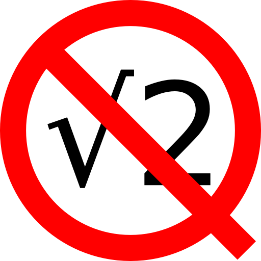
I could only read it as "No Irrationality" or similar before reading the comments - the Q doesn't count unless it's blackboard bold IMHO! Pretty though.
Blackboard-bold is common but by no means universal - plain old bold turns up in some works. Whatever the stylization the point is Q-for-quotient, not the font.
I've been inclined to think of it as a symbol based on a "Q" myself, though I admit the distinction is fuzzy, certainly it's still often written as a "Q" and pronounced as a "Q".
I know I know, I'm just making excuses for not having seen it. (There's one in the title of my PhD thesis, as it happens, and I remember being mildly unhappy that the bookbinder couldn't do blackboard bold on the spine!)
I assume the blackboard bold was exactly that. An attempt to reproduce the printer's bold on a blackboard. The printer was emulating the pen; I bet if you use a quill or other broad-nibbed pen you can do normal weight and bold quite easily.
At some point the printers started emulating the blackboard, and TeX set everything in stone.
It's realted to the convention of putting a wiggly underline on your named vectors. That's an editor's instruction to the typesetter to use bold weight characters. That convention hasn't been very widely emulated in print yet (thank goodness).
(no subject)
Date: 2007-06-01 07:55 am (UTC)(no subject)
Date: 2007-06-01 08:05 am (UTC)(no subject)
Date: 2007-06-01 10:25 am (UTC)(no subject)
Date: 2007-06-01 11:24 am (UTC)(no subject)
Date: 2007-06-01 05:55 pm (UTC)At some point the printers started emulating the blackboard, and TeX set everything in stone.
It's realted to the convention of putting a wiggly underline on your named vectors. That's an editor's instruction to the typesetter to use bold weight characters. That convention hasn't been very widely emulated in print yet (thank goodness).